Ever wondered what is Responsive Web Design?
Access to internet has moved out of the four walls; with the advent of wifi hotspots, mobile network, etc. it has made way to peoples’ pockets. People access visit websites through different kind of devices- tabs, LCDs and small mobile phones, and with that rises the necessity of a design that is mobile ready or rather compatible with all devices. Basically, responsive design developed as a way to offer equal access to information irrespective of the device
Responsive Web Design, also known as reactive design, is a web designing concept that creates changes which are dynamic to the appearance of the website and depends on the orientation and the display size of the device in which a viewer views it. Responsive design has come to rescue as people these days use different kind of devices in viewing websites- from tiny phones to huge desktop monitors and LEDs. Having content pulled from one source and delivered to different viewports allows you to use one centralized source for generating content, which is why it’s important to use Content Management Systems for your website.
Responsive design does uses the breakpoints to regulate the appearance of the site wherein one design is used above the breakpoint and one under it. The breakpoints are dependent on the width of the browser that the user is using making it mobile ready.
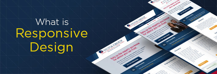
Responsive Design means your customers get an optimized experience on whatever device they visit your site on
Interestingly, the same HTML is accessed by all kinds of devices. It has minimized the work and investment- because now with the development of responsive web design, there is no need of creating different codebases to displays of different sizes.
The benefits of converting your site into a Responsive Website
- First and foremost, creating one optimized website would make it accessible by all the devices. Technology is moving at a very fast pace and thus it is imperative that the developers keep pace with that. As mentioned above, the need is to create a website that caters to all users. A regular website turns into a mobile website by this process
- It helps in minimizing costs; with Responsive Design in place, the need of designing different sites to suit different screen sizes would fade away. That would eventually minimize the costs as well since there would be no need to maintain different websites
- A fully responsive website would mean freedom from tracking how users navigate in the site. The available site analysis tools like Google are optimized to track the usage in multiple devices. That implies that all the data would be consolidated to one report.
- Track user journeys, conversion paths, funnels and redirections between your sites. Site analytics tools like Google Analytics are now optimized to handle multiple devices and responsive reporting. All of your tracking and analytics will continue to function and be condensed into one report, allowing for easier monitoring and analysis.
Responsive Design Examples
We strive to provide best websites to all of our clients, and that means offering modern solutions and coding techniques. Browse our extensive Web Design Portfolio or look at some of our recent responsive website projects to see what you can expect from working with Beta Images.